 You have a WordPress website but it just doesn’t work on all platforms, i.e. cell phones, tables AND desktops, the dilemma is how to attack this. Google has pointed out that they are more inclined to index a site higher that is set up for Adaptive and Responsive sites than those with a mobile app.
Mobile apps are nice for ‘converting’ a site for mobile with little or no work. The problem with the mobile apps is they tend to change the user experience from desktop to mobile where the design/user interface is altered or changed altogether.
Responsive design ‘converts’ a site so that it will reorganize the look and feel, navigation, content and images to fit within the device the site is being viewed on via css. This means if you have a desktop you will see the site as it was intended. When viewed on a tablet the site will transform to fit within the limitation of the viewing area.

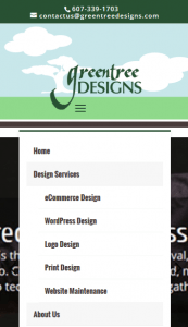 This happens simply by wrapping content to the next row, resizing photos fluidly, changing text size and changing your navigation into what is called a hamburger menu. The hamburger menu allows the user view the header navigation with a click of a button displaying the navigation elements available to the desktop users, just in a different configuration.
For those that want to control the experience at every level including a Responsive design, Adaptive design takes mobilizing your site one step further. Adaptive design helps control the responsiveness of your site by resizing the site to fit exact resolutions set via your css. This means if the user resizes their desktop browser, the site will automatically alter its appearance to accommodate for the size change.
Combining both Responsive and Adaptive designs helps a site on both levels of the viewer experience. If you are interested we’d be happy to discuss with you further how we can convert your WordPress site for a better, mobilized experience. Contact us today!